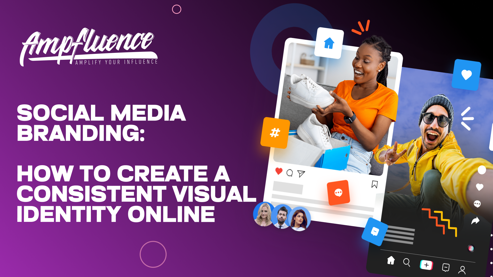
In the vast, noisy landscape of the internet, your brand has about three seconds to make an impression. Three seconds to signal who you are, what you stand for, and why a user should stop scrolling. If your posts look like they were created by five different people on five different days, you’re not just being inconsistent—you’re losing the single most powerful tool for recognition: visual consistency.
Think about brands like Coca-Cola, Tiffany & Co., or even Netflix. You don’t need to see their name to know who they are—a specific shade of red, a certain font, or a signature pattern instantly tells the story. That is the power of a strong visual identity. When your audience sees a post, they should know it’s yours before they even read the name. For businesses that want to build this level of consistency strategically, working with a digital marketing agency in Bangladesh can provide the creative direction and structured branding framework needed to stand out in competitive online spaces.
Ready to stop confusing your audience and start building genuine brand loyalty? Here is your step-by-step guide to creating a consistent, captivating visual identity across all your social media channels. A social media marketing agency like SIXGUN can help implement these changes if you need external support.
Step 1: Define Your Core Visual Elements (The Non-Negotiables)

A consistent brand starts with a rigid framework. These are the elements that can never change.
The Color Palette: Your Brand’s Emotional Anchor
Your colors communicate emotion instantly. Choose them wisely, and stick to the rules:
- Primary Colors (2-3): These should be the dominant colors that represent your brand’s core feeling (e.g., blue for trust, yellow for energy). Use these for your main graphics, backgrounds, and logos.
- Secondary Colors (2-3): Use these for accents, calls-to-action (CTAs), borders, or supporting visuals. They add variety without creating chaos.
- The Golden Rule: Always use the same Hex Codes (e.g., #007bff). Save these precise codes in a digital “Brand Guide”—it’s the only way to ensure consistency across every platform and designer.
Typography: The Voice of Your Words
Your fonts give your content a personality. Don’t let them clash!
- Header Font (1): A bold, attention-grabbing font for headlines, quotes, and primary text.
- Body Font (1): A clean, legible font for captions, descriptions, and supporting text.
- The Limit: Never use more than two font families. Beyond that, your message looks messy. Stick to specific rules for sizing and weights (e.g., Header is always Bold 36pt, Body is Regular 16pt) to ensure immediate readability and professionalism.
Step 2: Establish Your Image & Graphic Style (The Vibe)

It’s not enough to use good pictures; they must look like your pictures. This is how your feed goes from a random collection of posts to a cohesive, scroll-stopping gallery.
- The Filter/Tone Rule: Decide on a consistent editing style. Are your photos bright and airy? Dark and moody? Warm and retro? Use the same preset or filter on every single image before it’s posted. This creates a recognizable “feed aesthetic.”
- Layout and Templates: Use a design tool like Canva to streamline content creation. Instead of designing from scratch every time, create 3-5 standard templates for recurring content types:
- One template for a Quote Graphic (large text, solid background).
- One for a Tip Carousel Cover (photo grid, branded corner logo).
- One for a Call-to-Action box (accent color background, white text).
- Crucially: The placement of your logo and handle must be consistent on every piece of graphic content you own.
- Photography Style: Whether you hire a professional or use stock photos, source all visuals from a collection that shares a similar subject matter, lighting, and composition. Avoid mixing highly realistic studio shots with low-resolution phone photos.
Step 3: Implement Consistency Across All Platforms

Your visual identity must be instantly recognizable, whether a person finds you on TikTok, LinkedIn, or Instagram. You need a unified look that screams, “It’s me!”
Here’s where you lock in the cross-platform cohesion:
- Profile Photo: This is your primary identifier. Use the same high-resolution logo or headshot on all channels. No exceptions.
- Cover Photo/Banner: Use your primary brand colors and core messaging here. Make sure the design is clean and fits each platform’s unique dimension requirements without cutting off key information.
- Link in Bio: Use a branded Link-in-Bio tool (like Linktree or your own landing page) that features your color palette and logo. Your off-platform links should feel just as branded as your feed.
- Video Watermark: If you create short-form video, place your logo and/or handle in the same corner (e.g., top right) of every single video. This protects your content and reinforces branding.
- Highlight Covers (Instagram/TikTok): Use icons with your secondary colors or patterns for your saved stories or video playlists to keep the overall profile look clean and professional.
The One-Minute Test: Ask a friend who knows your brand to look at a random piece of your content—or an entire profile page. If they can’t immediately say “That’s definitely your brand” within 60 seconds, your consistency needs work.
Step 4: Systematize and Schedule Your Success
You’ve defined the rules—now make them easy to follow. A digital brand guide (even a simple Google Doc) is your blueprint for success.
- List Your Assets: Document all Hex Codes, Font Names, and the exact links to your approved logo files.
- Save Templates: Store all your editable graphics and raw visual assets in one organized cloud folder (like Google Drive or Dropbox).
- Use a Scheduler: Utilize scheduling tools like Buffer, Later, Hootsuite, or Sendible. They allow you to visually preview your content calendar, ensuring your overall feed looks cohesive and balanced before posts go live. This lets you catch inconsistencies with a single glance.
A consistent visual identity is not about perfection; it’s about predictability. When your audience knows what to expect, they don’t just consume your content—they recognize it, trust it, and are more likely to engage and convert.
Key Takeaways for Visual Branding Success
- Codify Your Colors: Always use the same Hex Codes for your primary and secondary color palettes.
- Limit Your Fonts: Stick rigidly to two font families (one for headers, one for body text) across all platforms.
- Standardize Filters: Apply the same editing preset or tone to every photo to maintain a cohesive feed aesthetic.
- Template Everything: Create and reuse 3-5 branded templates for recurring content types to save time and ensure visual uniformity.
- Unify Your Profile: Use the same profile photo (logo/headshot) across all social media channels for instant recognition.


6 Responses
I really like this article! It helps me understand how to make my brand look nice online.
I always learn something new when I visit your blog. https://www.dagwoodsvacservices.ca/
This piece clearly shows how consistent visual branding builds recognition and trust across platforms, turning scattered content into a cohesive, professional presence that audiences instantly recognize and remember.
My local library was having a quiet day so I went there to read but forgot my book on the kitchen table. I didn’t want to drive back home so I decided to use their Wi-Fi to find some fun games. I landed on Rooli Casino and spent a while browsing through their table games. For anyone in Australia they have a very solid reputation and some interesting VIP levels that feel quite rewarding. It was a funny way to spend time in a library and I enjoyed it.
I came across this platform through an online ad while reading sports news in Australia. Instead of jumping straight in, I looked into the current Mateslots bonuses to understand what was available. I played carefully, but still ran into a losing streak that made me think about stopping. One later win changed the balance just enough to make the whole session feel fair and satisfying.
Last week I had my heart set on buying a new camera lens, but saving up just wasn’t working out. After a few setbacks, I tried my luck on playfina casino australia and actually won the amount I needed. A friend had recommended the site for its fair terms. The payout to my Australian account went through without any issues. I was finally able to get the lens I’d been wanting for so long.